
Portfolio | Showmax: Expert Review
The Process
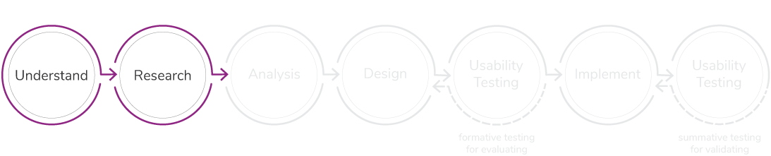
For this project, I only focus on the first two stages of the process.
01 – Understand
An expert review is an inexpensive, timesaving and indirect data-gathering method. It is used to examine the usability of a website, app or product, to identify any potential usability issues and recommend solutions to improve it.
As a fan of South African TV, I regularly use Showmax to access local content through their TV app. The 5-year old streaming service provider offers a wide variety of local and international movies, series, shows, documentaries and live sport. I can attest to the fact that there is always something engaging on the platform for a diverse audience.
Through using the platform and secretly observing my houseguests, use the platform – I noticed a few usability issues on the Showmax TV app that I unpack in this case study.

02 – Research
Below are results from the cognitive walkthrough on Showmax, focussing on different tasks – as at September 2020.

Click on picture to enlarge.
Task scenario 1: You are not sure what to watch on Showmax. You have scrolled all the way down through all 42 categories and still remain undecided. So you opt to watch some sports. Navigate to the sports section from the last category at the bottom.
Usability issue: Motor load. For the user to navigate to the sports section in the main navigation menu, they have to press the up arrow remote button 44 times.
Solution: Persistent navigation: to decrease the button presses, have the main navigation menu accessible at any given navigational level.

Click on picture to enlarge.
Task scenario 2: Go to the kids section.
Usability issue: Poor affordance. The smiley face icon is quite difficult to understand. Some users mistook it for “my favourites” or “highly rated content”.
Solution: Pair the icon with a text label that says “Kids”. Alternatively omit the icon and only use a text link, like the rest of the main navigation.
Click on picture to enlarge.
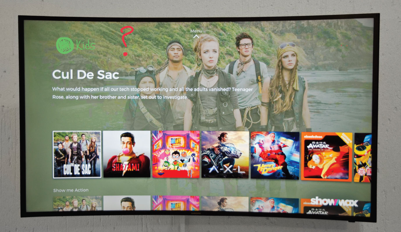
Task scenario 3: You have just clicked on the smiley face icon (previous task), which section are you in of the Showmax application?
Usability issue: Unclear indication of location. The landing page of the kids section does not tell the user where they are on the Showmax application.
Solution: Clearly indicate the current location within the Showmax application.

Click on picture to enlarge.
Task scenario 4: You have unintentionally landed on the kids section on the Showmax application. Return to your profile.
Usability issue: Ambiguous navigation path. Clicking on ‘exit kids’ takes one to the profiles selection page and not back to the profile they came from. This is confusing as there is another way of getting to the profiles selection page.
Solution: The link “exit kids” should allow the user to return to their profile.

Click on picture to enlarge.
Task scenario 5: You are in the movies section of Showmax, use the filter to find movies in a specific language.
Usability issue: The hamburger menu lacks an information scent. The insufficient space for navigation tabs has resulted in the use of this type of menu. The issue here is that the icon obscures information. Making it harder for users to know what is hiding behind the icon.
Solution: Pair the icon with a text label that says “filters” or “categories” underneath the icon.
Click on picture to enlarge.
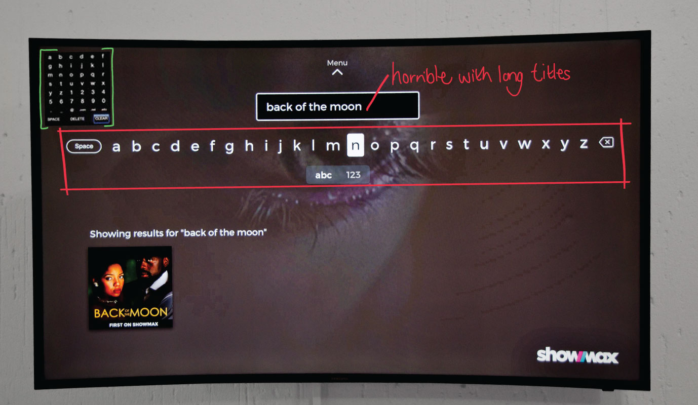
Task scenario 6: Use the search option to find a specific movie that you are looking for.
Usability issue: Motor load. The horisontal design of the keyboard is not ideal for a TV remote.
Solution: Efficient keyboard design. A keyboard that allows for vertical and horisontal movement, in order to reduce user workload.

Click on picture to enlarge.
Task scenario 7: You finally have time to continue watching a series you stared a month ago. Go search for the series and continue watching it.
Usability issue: Insufficient information at first glance. Users cannot immediately tell what options they have available to continue to watch. Not all thumbnails indicate the name of the movie/series/show, until you hover over it.
Solution: Always use cover art instead of thumbnails of where one paused in the movie/series/show.
Click on picture to enlarge.
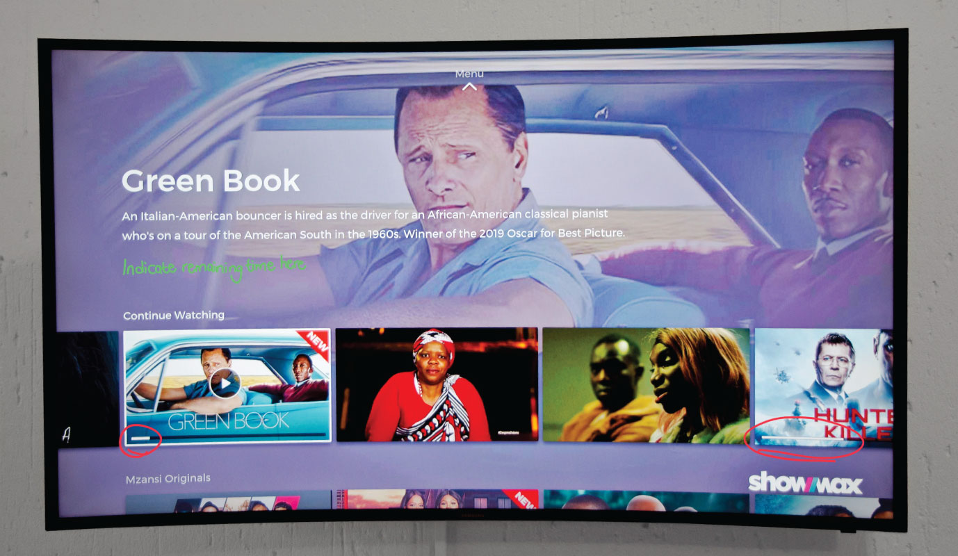
Task scenario 8: You are on a 30-minute study break and would like to continue watching something during this time. Select something to watch according to the time you have to spare.
Usability issue: Insufficient information at first glance. Users do not know the remaining time of what they can continue to watch, until they actually watch the movie/series/show. The progress bar does not work in this case, as it only indicates a fraction of a whole and not the actual time.
Solution: Include remaining time to the information that is revealed when one hovers over the cover art.

Click on picture to enlarge.
Task scenario 9: You have missed a very important conversation in a specific scene of a movie you are currently watching. Rewind to replay that specific part in the movie.
Usability issue: Intellectual load. Users need to estimate how far they need to rewind or fast-forward to a specific part in a movie/series/show, according to the 10-seconds.
Solution: Show users thumbnails of the movie, instead of 10-second times.

Click on picture to enlarge.
Task scenario 10: You need to leave the house in 18-minutes and you are wondering if the show you are watching will be done by then.
Usability issue: Intellectual load. When users want to find out the remaining time of what they are currently watching they literally have to calculate to determine how far they are till the end.
Solution: Use a countdown of time on the right. To avoid having to calculate the remaining time.
View other portfolio projects

01
Mentorship
Platform
03
A/B
Testing

04
E-commerce
Car Insurance